Aletheia’s Branding
Building a private tuition brand from scratch.
Case Study
A unique learning space
Aletheia is a highly selective community of doctoral-level educators, providing their students with a unique space in which academic research and tuition flourish symbiotically. Their goal was to reflect this in their brand and digital presence.
Through an exercise in brand placement, a tone of voice and brand personality was established. The logo-mark came next. We went through many different typefaces before we set ourselves on the one we finally chose.
The website needed to be easy to navigate through and contain all the relevant information at a glance. We decided to go for a one-pager with scroll-animations throughout to make the page feel interactive and alive.
Creative direction
Brand development & extension
Website design
Project management
My Role
Visualising Knowledge
Together, we established why they do what they do (vision), how they do it (mission), what they do (product), values they resonate with, and the brand personality.


The humble tree is one of our most powerful visual metaphor for organising information and distilling our understanding of the world.

I used the DNA’s helix structure as inspiration for the trunk and the tree flowing out from it.
A website that’s both personal & professional
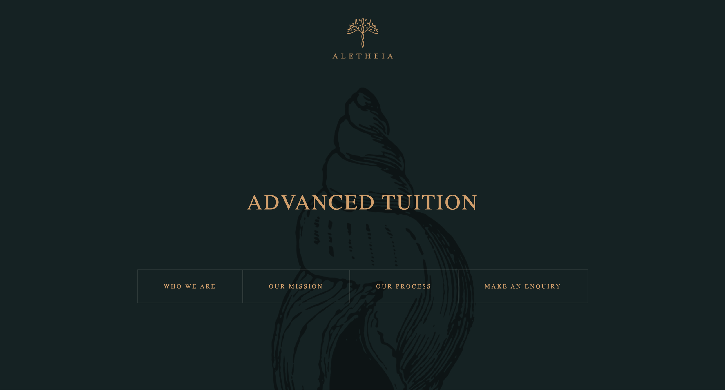
The goal was to achieve an aesthetic that was personal yet professional. The website needed to reflect their personality through not only content but also the illustrations, colour palette, typography, and overall style. We chose to go with a combination of serifs, nautical sketch-like illustrations, and a deep green and cream colour palette.


Smooth, Scroll-Enabled Animations
The animations we used through out the website needed to be simple yet interactive for all types of users and devices. We decided on different sections having different colours which blended into one another. We also used the nautical illustrations and handwritten text to give the feeling that one is exploring an old manuscript.
“To teach is to create a space in which obedience to truth is practiced.”
Aletheia is one of my favourite projects because I’ve seen the brand come to life. From branding and physical collateral design to UX design and development for the website, the entire process was handled between Vishal (front-end developer) and me.
The feedback from Aletheia’s clients has been great and the branding and website has helped get the word out there about their services within Switzerland. The next step would be to gather user data and optimise the website even more, starting with booking services for individual tutors.